
.jpg)
I took this photo with my trusty ol' point-and-shoot this weekend (because I forgot my DSLR, oops). If you look at the second one for a while, then look back at the first one you'll think "How did I even think this one looked good before? It's so drab!" At least, that's what I thought. I also softened their faces a little with a gaussian blur, but you can't really tell because their faces are so soft to begin with.

.jpg)
I liked this photo to begin with, but then I played with the color saturation and now I LOVE this photo.

.jpg)
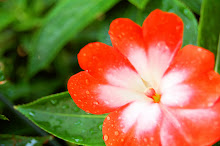
I wanted to share this one because I over-did it a little. I pushed the saturation and hue past what I normally would set it at, and I like it. It gives it a little bit of an artsy feel. Well, I think so anyway.

.jpg)
With this photo, the difference is a little more subtle, but I still like it.
I think I've created a monster... I can't stop!


Good job, Rach!
ReplyDelete